System fonts
Table of contents
I wanted to compile a list with the pre-installed typefaces that come with the most popular operating systems, also known as system fonts. I focus, for now, on typefaces that can be used for setting body text—meaning that they have font files for regular, italic, bold, and bold italic—and not so much on display typefaces.
An advantage of system fonts over a web font is that they improve the loading performance of a web page because you don’t download extra font files. Additionally, they don’t cause a layout shift when they load as the web fonts do. You can also use system fonts that are similar to your web font to reduce that layout shift or to cover languages that your web font doesn’t cover. Finally, they give you access to some quality typefaces that would otherwise cost a lot to license for web use.
The main disadvantage of system fonts is consistency. You can’t be sure that a font will be available on all operating systems for all users. Even if you find similar alternatives, the fonts will probably have different metrics that may break a design. You can go around that if you use a web font for the critical pieces of your UI (e.g. buttons, menus, or large headlines) and use a system font for body text or a contrasting system font for captions.
Before web fonts, system fonts were the only option for webpages. As a result, there are a ton of resources about them, but most of them are outdated, and I didn’t want to go through them to discover the one that suited me. Additionally, Microsoft and Apple have some nice lists with the pre-installed fonts, so I decided to scrap that data and put them in a table with some filters.
I can’t say that I learned something exciting to share, but maybe I can offer you some alternative font stacks you haven’t consider, organized by typeface classification. You can also use the table to find a better combination by yourself.
Before I give you the table with the system fonts, I want to point out some things first:
- I didn’t include Android fonts because Android comes with only 3 versatile typefaces (with at least the 4 font files I mentioned above) pre-installed: Roboto (Grotesque sans-serif), Noto Serif (contemporary serif that’s based on Droid Serif), and Droid Sans Mono (monospace). You can’t set any of them by name, only with keywords like sans-serif, serif, etc. I have more details on the disclaimers.
- Windows offers some nice extra fonts with the pan-European supplemental fonts feature. It also has fonts that you can use with office applications, and some of them can be used inside the browser.
See the complete list of disclaimers / future improvements.
System fonts table
Filters
- Type:
- Classification:
- Weight & style:
- Operating system:
- Selected Filters:
- No filters selected.
55 fonts match the filters.
Go to filters| Name | Type | Classification | Operating System | Weights & Styles | Notes |
|---|---|---|---|---|---|
| Arial | sans-serif | neo-grotesque | Windows 10, iOS 13, macOS Catalina. | 400, 400i, 700, 700i, 900 | 900 not available on iOS 13, macOS also has Arial narrow. |
| Athelas | serif | humanist (old-style) | iOS 13 (document font), macOS Catalina (document font). | 400, 400i, 700, 700i | “Inspired by Britain’s classic literature, Athelas is an elegant book font family for screen and print.” From: https://www.type-together.com/athelas-font |
| Avenir | sans-serif | geometric | iOS 13, macOS Catalina. | 300, 300i, 400, 400i, 500, 500i, 800, 800i, 900, 900i | |
| Avenir Book | sans-serif | geometric | iOS 13, macOS Catalina. | 400, 400i | |
| Avenir Next | sans-serif | geometric | iOS 13, macOS Catalina. | 200, 200i, 400, 400i, 500, 500i, 600, 600i, 700, 700i, 800, 800i | It also has the same weights/styles for condensed (Avenir Next Condensed). “The Avenir® Next font family was designed by Adrian Frutiger in collaboration with Monotype Type Director Akira Kobayashi. It was an expanded reworking of the original font family (released as an OpenType font with both oldstyle and lining figures) and received considerable acclaim upon its publication by Linotype in 2004.” From: https://www.fonts.com/font/linotype/avenir-next/story |
| Baskerville | serif | transitional | macOS Catalina, iOS 13. | 400, 400i, 600, 600i, 700, 700i | |
| Bodoni 72, Bodoni 72 Oldstyle, and Bodoni 72 Smallcaps | serif | rational | macOS Catalina, iOS 13. | 400, 400i, 700 | |
| Book Antiqua | serif | neo-humanist | macOS Catalina (document font). | 400, 400i, 700, 700i | |
| Bookman Old Style | serif | transitional | macOS Catalina (document font). | 400, 400i, 700, 700i | https://www.typewolf.com/site-of-the-day/fonts/bookman |
| Calibri | sans-serif | humanist | Windows 10. | 300, 300i, 400, 400i, 700, 700i | |
| Cambria | serif | transitional | Windows 10. | 400, 400i, 700, 700i, math | |
| Candara | sans-serif | humanist | Windows 10. | 300, 300i, 400, 400i, 700, 700i | |
| Carlito | sans-serif | humanist | iOS 13 (document font), macOS Catalina (document font). | 400, 400i, 700, 700i | It is based on Lato |
| Century Gothic | sans-serif | geometric | macOS Catalina (document font). | 400, 400i, 700, 700i | |
| Century Schoolbook | serif | rational | macOS Catalina (document font). | 400, 400i, 700, 700i | |
| Charter | serif | contemporary, transitional | iOS 13, macOS Catalina. | 400, 400i, 700, 700i, 900, 900i | |
| Chochin | serif | humanist (old-style) | iOS 13, macOS Catalina. | 400, 400i, 700, 700i | |
| Comic Sans | cursive | cursive | Windows 10. | 400, 400i, 700, 700i | |
| Consolas | monospace | monospace | Windows 10. | 400, 400i, 700, 700i | |
| Constantia | serif | contemporary, transitional | Windows 10. | 400, 400i, 700, 700i | |
| Corbel | sans-serif | humanist | Windows 10. | 300, 300i, 400, 400i, 700, 700i | |
| Courier | slab serif | monospace | macOS Catalina, iOS 13. | 400, 400i, 700, 700i | |
| Courier New | slab serif | monospace | Windows 10, macOS Catalina, iOS 13. | 400, 400i, 700, 700i | |
| Didot | serif | rational | macOS Catalina, iOS 13. | 400, 400i, 700 | |
| Forgotten Futurist | sans-serif | display futurist | macOS Catalina (document font). | 400, 400i, 700, 700i | https://typodermicfonts.com/forgotten-futurist/ |
| Futura | sans-serif | geometric | macOS Catalina, iOS 13. | 500, 500i, 700 | It also has condensed for 500 and 800? (extrabold). |
| Galvji | unknown | unknown | macOS Catalina. | 400, 400i, 700, 700i | The iOS doesn't have the oblique. |
| Garamond | serif | humanist (old-style) | macOS Catalina (document font). | 400, 400i, 700, 700i | |
| Georgia | serif | transitional | Windows 10, macOS Catalina, iOS 13. | 400, 400i, 700, 700i | |
| Gill Sans | sans-serif | humanist, geometric | macOS Catalina, iOS 13. | 300, 300i, 400, 400i, 600, 600i, 700, 700i, 900 | 900? ultrabold |
| Helvetica | sans-serif | neo-grotesque | macOS Catalina, iOS 13. | 300, 300i, 400, 400i, 700, 700i | |
| Helvetica Neue | sans-serif | neo-grotesque | macOS Catalina, iOS 13. | 100, 100i, 200, 200i, 300, 300i, 400, 400i, 500, 500i, 700, 700i | It also has 700 and 900 for condensed. |
| Helvetica CY | sans-serif | neo-grotesque | macOS Catalina (document font). | 400, 400i, 700, 700i | |
| Hoefler Text | serif | humanist (old-style) | macOS Catalina, iOS 13. | 400, 400i, 700, 700i | |
| Iowan Old Style | serif | humanist (old-style) | iOS 13 (document font), macOS Catalina (document font). | 400, 400i, 700, 700i, 900, 900i | 900, 900i are available only on macOS. |
| Menlo | monospace | monospace | macOS Catalina, iOS 13. | 400, 400i, 700, 700i | |
| Mshtakan | unknown | unknown | macOS Catalina. | 400, 400i, 700, 700i | |
| New Peninim MT | unknown | unknown | macOS Catalina. | 400, 400i, 700, 700i | |
| Optima | sans-serif | humanist, inscriptional | macOS Catalina, iOS 13. | 400, 400i, 700, 700i, 900 | 900? ultrablack |
| PT Sans | sans-serif | humanist | macOS Catalina. | 400, 400i, 700, 700i | Also 400, 700 for small optical size (PT Sans Caption), and 400, 700 for narrow width (PT Sans Narrow). |
| PT Serif | serif | transitional | macOS Catalina. | 400, 400i, 700, 700i | Also 400, 700 for small optical size (PT Serif Caption). |
| Palatino Linotype, Palatino on mac | serif | neo-humanist | Windows 10, macOS Catalina, iOS 13. | 400, 400i, 700, 700i | |
| Rockwell | slab serif | geometric | macOS Catalina, iOS 13. | 400, 400i, 700, 700i | |
| Segoe UI | sans-serif | humanist | Windows 10. | 200, 200i, 300, 300i, 400, 400i, 600, 600i, 700, 700i, 900, 900i | |
| Sitka Text, Sitka Small, Sitka Subheading, Sitka Heading, Sitka Display, Sitka Banner | serif | contemporary | Windows 10. | 400, 400i, 700, 700i | |
| STIXGeneral | serif | transitional | macOS Catalina, iOS 13 (document font). | 400, 400i, 700, 700i | https://www.stixfonts.org/ |
| STIXNonUnicode | serif | transitional | macOS Catalina, iOS 13 (document font). | 400, 400i, 700, 700i | https://www.stixfonts.org/ |
| Shree Devanagari 714 | unknown | unknown | macOS Catalina. | 400, 400i, 700, 700i | |
| Seravek | sans-serif | humanist | macOS Catalina (document font), iOS 13 (document font). | 200, 200i, 300, 300i, 400, 400i, 500, 500i, 700, 700i | |
| Superclarendon | slab serif | grotesque | macOS Catalina (document font), iOS 13 (document font). | 300, 300i, 400, 400i, 700, 700i, 900, 900i | |
| Times | serif | transitional | macOS Catalina. | 400, 400i, 700, 700i | |
| Times New Roman | serif | transitional | Windows 10, macOS Catalina, iOS 13. | 400, 400i, 700, 700i | |
| Trebuchet MS | sans-serif | humanist | Windows 10, macOS Catalina, iOS 13. | 400, 400i, 700, 700i | |
| Tw Cen MT or Twentieth Century | sans-serif | geometric | macOS Catalina (document font). | 400, 400i, 700, 700i | |
| Verdana | sans-serif | humanist | Windows 10, macOS Catalina, iOS 13. | 400, 400i, 700, 700i |
Some system font stacks
7 typefaces are available on all three of Windows, macOS, and iOS:
- Arial,
- Courier New,
- Georgia,
- Palatino (Palatino Linotype on Windows),
- Times New Roman,
- Trebuchet MS,
- and Verdana.
If you value consistency, you can go with one of them. I will mention them in the following sections where I organize the font stacks by classification.
Default OS font stack
The first option you have—and one of the best—is to use the default operating system fonts. You can do this with the system-ui value for the font-family in CSS:
html {
font-family: system-ui, sans-serif;
}How your browser renders the stack
A peep at some distant orb has power to raise and purify our thoughts like a strain of sacred music, or a noble picture, or a passage from the grander poets. It always does one good.
If you want better support for the system-ui value, you can use the
system-font-css package that creates a @font-face that references the fonts by file name (not by font family name). This system font stack uses San Francisco (neo-grotesque sans-serif) on macOS/iOS, Segoe UI (humanist sans-serif) on Windows, Roboto (grotesque sans-serif) on Android, and Ubuntu (humanist sans-serif) on Ubuntu.
I used to include the system-font-css package on this blog, but I noticed that it renders Tahoma on macOS Firefox for some reason. As a result, if you care about Firefox on mac, it’s better to explicitly state the family names in the stack. I copied this stack from the VS Code autocomplete feature, and I added the system-ui value in front:
html {
font-family: system-ui, -apple-system, BlinkMacSystemFont, "Segoe UI", Roboto,
Oxygen, Ubuntu, Cantarell, "Open Sans", "Helvetica Neue", sans-serif;
}How your browser renders the stack
A peep at some distant orb has power to raise and purify our thoughts like a strain of sacred music, or a noble picture, or a passage from the grander poets. It always does one good.
If you want to get the system fonts in older operating systems (Windows XP, Mac before Yosemite), you can append their system fonts before the sans-serif keyword (I haven’t tested this). For example, if you take the system-font-css package’s readme and source code as an example:
html {
font-family: system-ui, -apple-system, BlinkMacSystemFont, "Segoe UI", Roboto,
Oxygen, Ubuntu, Cantarell, "Open Sans", "Helvetica Neue", "Lucida Grande",
Tahoma, sans-serif;
}How your browser renders the stack
A peep at some distant orb has power to raise and purify our thoughts like a strain of sacred music, or a noble picture, or a passage from the grander poets. It always does one good.
It’s also worth mentioning that we now have keywords for standard font families such as ui-serif, ui-sans-serif, ui-monospace, and ui-rounded, but, at the time of writing, only newer versions of Safari support them. The keywords are still useful because it’s hard to reference the system fonts inside the browser in macOS/iOS (for example: San Francisco Mono or New York) due to the fact that they have obscure font family names. For example, you can’t say that you want font-family: "San Francisco" and get San Francisco.
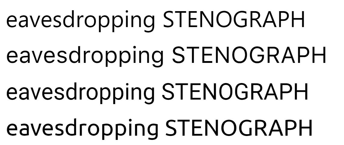
In the picture below, you can see the typefaces I mentioned in this section. For this one and for the following specimens, I didn’t adjust the x-height so you can see the metric differences in the same font size. You can view the full-size image in a new window if you click on the image.
Neo-grotesque stack
A popular stack, you probably have already seen, is an Arial/Helvetica stack:
html {
font-family: "Arial Nova", Helvetica, Arial, sans-serif;
}How your browser renders the stack
A peep at some distant orb has power to raise and purify our thoughts like a strain of sacred music, or a noble picture, or a passage from the grander poets. It always does one good.
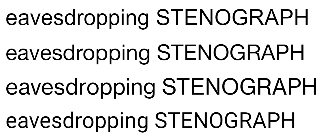
You get Roboto on Android, which is a bit less uniform than Helvetica, but it’s a pretty close match. You can alter the previous font stack by adding Helvetica Neue for macOS/iOS because it has more weights than Helvetica. You can also add Neue Haas Grotesk Text Pro (what a mouthful) or Arial Nova over Arial for Windows, in case a Windows user downloaded the pan-European supplemental fonts:
html {
font-family: "Helvetica Neue", "Neue Haas Grotesk Text Pro",
"Arial Nova", Helvetica, Arial, sans-serif;
}How your browser renders the stack
A peep at some distant orb has power to raise and purify our thoughts like a strain of sacred music, or a noble picture, or a passage from the grander poets. It always does one good.
You can also use San Francisco (via the -apple-system, BlinkMacSystemFont values) over Helvetica on macOS/iOS.
Humanist sans-serif
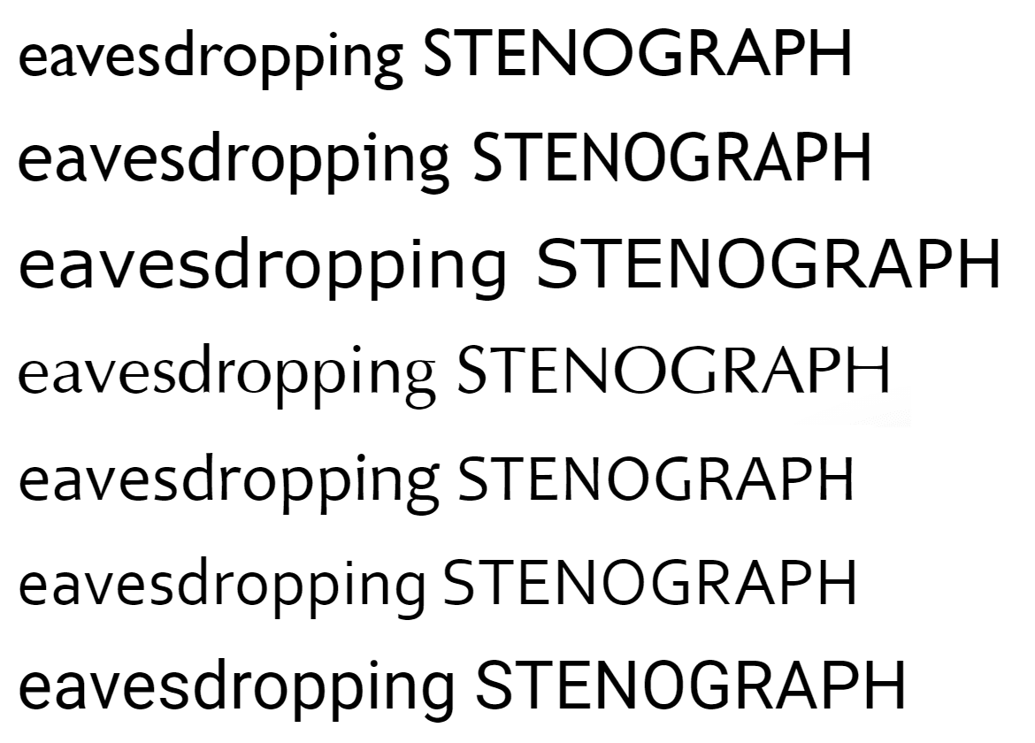
You have a lot of options for a humanist sans-serif. You can take Trebuchet MS or Verdana if you want consistency because there are both available in Windows, macOS, and iOS:
html {
font-family: "Trebuchet MS", sans-serif;
/* or */
font-family: "Verdana Pro", Verdana, sans-serif;
}How your browser renders the stacks
A peep at some distant orb has power to raise and purify our thoughts like a strain of sacred music, or a noble picture, or a passage from the grander poets. It always does one good.
A peep at some distant orb has power to raise and purify our thoughts like a strain of sacred music, or a noble picture, or a passage from the grander poets. It always does one good.
You can’t say that either of them is a good match for Roboto, though.
Trebuchet MS is a bit dark, and because I’m not the biggest fan, Gill Sans would be a better alternative for macOS/iOS. On the other hand, Trebuchet is a lot larger than Gill Sans and may create inconsistencies between platforms.
html {
font-family: "Gill Sans Nova", "Gill Sans", "Gill Sans MT",
"Trebuchet MS", sans-serif;
}How your browser renders the stack
A peep at some distant orb has power to raise and purify our thoughts like a strain of sacred music, or a noble picture, or a passage from the grander poets. It always does one good.
Other options you have on Windows include Segoe UI, Corbel, and Candara. I like the last two because they have nice Greek. In the following stack, I put all of them by preference, but you can keep only the one you like. On macOS/iOS, you can use Optima. Optima has a stronger character than the 3 previous Windows fonts, but I can’t find a closer match.
html {
font-family: Optima, Candara, Corbel, "Segoe UI", sans-serif;
}How your browser renders the stack
A peep at some distant orb has power to raise and purify our thoughts like a strain of sacred music, or a noble picture, or a passage from the grander poets. It always does one good.
Roboto is not a close match on Android, but at least it has a lot of weights and OpenType features.
Old-style (humanist) serif
Windows doesn’t offer an old-style typeface, but it offers Palatino Linotype which is pretty close. For Mac and iOS, you can go with Hoefler Text:
html {
font-family: "Hoefler Text", "Palatino Linotype", Palatino, serif;
}How your browser renders the stack
A peep at some distant orb has power to raise and purify our thoughts like a strain of sacred music, or a noble picture, or a passage from the grander poets. It always does one good.
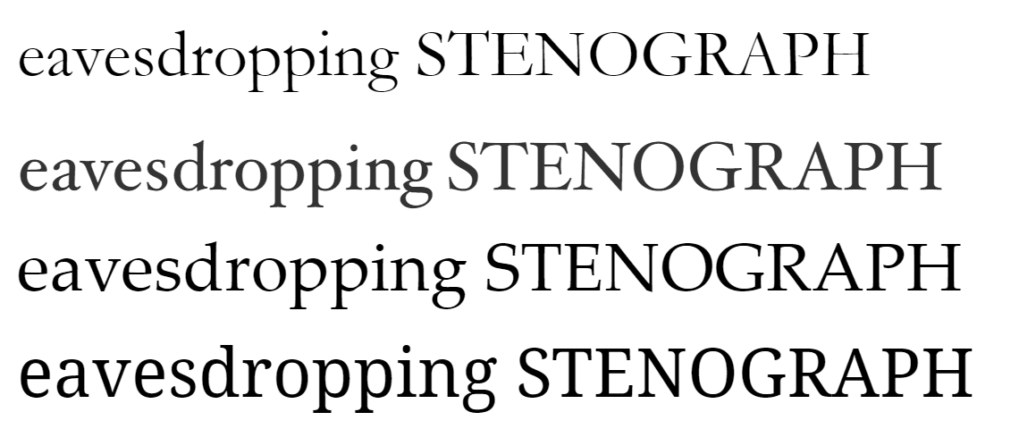
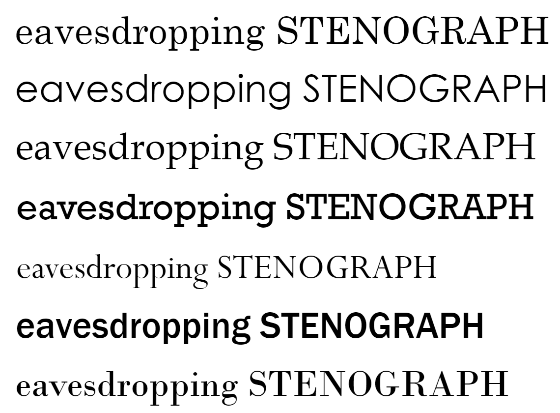
If you like Palatino and you want more consistency, you can drop Hoefler Text from the previous stack and use only Palatino because they are not similar in metrics (see the image below). The result in Android is not very good because you get Noto Serif which is a contemporary/transitional serif and doesn’t share many similarities with Palatino.
Transitional serif
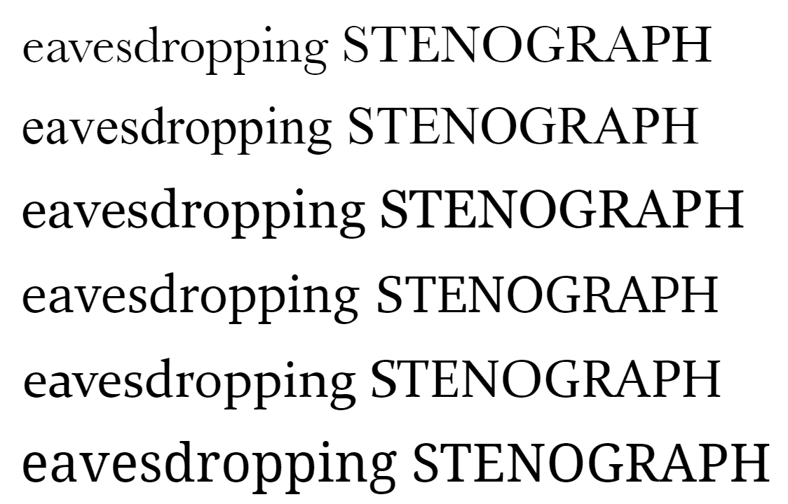
For a transitional serif, you have a lot of options. First of all, you have a pretty close match for Android (Noto Serif) and two options for Windows: Times New Roman and Georgia that are both available in macOS and iOS. If I had to choose, I would go with Georgia over Times New Roman because the latter is overused.
html {
font-family: "Georgia Pro", Georgia, serif;
}How your browser renders the stack
A peep at some distant orb has power to raise and purify our thoughts like a strain of sacred music, or a noble picture, or a passage from the grander poets. It always does one good.
On the other hand, Times New Roman has wide character support (something English focused typographers overlook) and some pretty cool swashes in italic—at least in the updated Windows version.
html {
font-family: "Times New Roman", Times, serif;
}How your browser renders the stack
A peep at some distant orb has power to raise and purify our thoughts like a strain of sacred music, or a noble picture, or a passage from the grander poets. It always does one good.
On macOS/iOS you have more options. For example, you can throw in something like Baskerville:
html {
font-family: Baskerville, "Georgia Pro", Georgia, serif;
}How your browser renders the stack
A peep at some distant orb has power to raise and purify our thoughts like a strain of sacred music, or a noble picture, or a passage from the grander poets. It always does one good.
An alternative is Charter:
html {
font-family: Charter, "Georgia Pro", Georgia, serif;
}How your browser renders the stack
A peep at some distant orb has power to raise and purify our thoughts like a strain of sacred music, or a noble picture, or a passage from the grander poets. It always does one good.
If you are interested in math symbols, you can add Cambria as a fallback, further down in the stack, for Windows. You can also try Constantia on Windows.
Contemporary serif
Windows 10 offers Sitka that comes in 6 optical sizes. If I read the Sitka description on the Microsoft Typography page correctly, the optical sizes are mainly for small sizes though—36px and below. You can choose Charter for macOS/iOS:
html {
font-family: Charter, "Sitka Text", "Georgia Pro", Georgia, serif;
/* Or even subheading for body text. */
font-family: Charter, "Sitka Subheading", "Georgia Pro", Georgia, serif;
}How your browser renders the stack
A peep at some distant orb has power to raise and purify our thoughts like a strain of sacred music, or a noble picture, or a passage from the grander poets. It always does one good.
Add a different optical size for the headings:
h1,
h2,
h3 {
font-family: Charter, "Sitka Banner", "Georgia Pro", Georgia, serif;
}How your browser renders the stack
A peep at some distant orb has power to raise and purify our thoughts like a strain of sacred music, or a noble picture, or a passage from the grander poets. It always does one good.
In Android, you get Noto Serif which is a good match.

Monospace
You can go with Courier New for a consistent design because it’s available on Windows, macOS, and iOS:
html {
font-family: "Courier New", Courier, monospace;
}How your browser renders the stack
A peep at some distant orb has power to raise and purify our thoughts like a strain of sacred music, or a noble picture, or a passage from the grander poets. It always does one good.
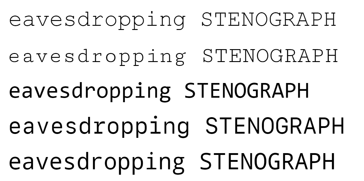
On Android, you’ll get Cutive Mono due to the Courier aliases, which is similar in color to Courier New but not in proportions. I’d say that is a good match.
If you want to use the monospaced font for code, I suggest Consolas for Windows, San Francisco Mono/Monaco/Menlo for macOS/iOS, and Droid Sans Mono for Android:
html {
font-family: Consolas, ui-monospace, Monaco, Menlo, monospace;
}How your browser renders the stack
A peep at some distant orb has power to raise and purify our thoughts like a strain of sacred music, or a noble picture, or a passage from the grander poets. It always does one good.
Resources
- Windows 10 typeface list from Microsoft typography site. You can select older versions of Windows to see what typefaces they support. See also the List of windows typefaces on Wikipedia. Note that Windows allows you to download pan-European supplemental fonts feature, and use in office 365 (not download) office cloud fonts.
- System fonts for iOS 13 and macOS Catalina on the Apple developer site. List of typefaces included with macOS, Wikipedia page.
- Android source code fonts.xml that lists the pre-installed Android fonts.
Disclaimers/future improvements
- Android comes with the following typefaces pre-installed:
- Roboto via the keywords: sans-serif, arial, helvetica, tahoma, verdana, sans-serif-thin, sans-serif-light, sans-serif-medium, sans-serif-black, and sans-serif-condensed.
- Noto Serif via the keywords: serif, times, times new roman, palatino, georgia, baskerville, goudy, fantasy, and ITC Stone Serif.
- Droid Sans Mono via the keywords monospace, sans-serif-monospace, and monaco.
- Cutive Mono via the keywords serif-monospace, courier, courier new.
- Coming Soon via the casual keyword.
- Dancing Script via the cursive keyword.
- Carrois Gothic SC via the sans-serif-smallcaps keyword.
- Noto Sans, Droid Sans, and Nanum Gothic as fallbacks (you can’t set them with a keyword or by name).
- Linux has mainly open-source (libre) fonts. If I recall correctly, it offers free alternatives to popular typefaces and aliases for them, the same thing Android does. I can add in the future the fonts bundled with a popular distribution like Ubuntu. The market share for Linux doesn’t seem to be over 1%, though (take that data with a grain of salt). On my blog, the Linux users are 10%, but it’s a programming blog with a very small sample size.
- In the table, I mention macOS and iOS document fonts. I initially thought (because I don��’t use a Mac or an iPhone) that these fonts will be available if requested by name in the browser. After testing on Mac with a virtual machine, I saw that they are not available inside the browser and are more like the Microsoft office fonts, so they are not reliable to use.
- macOS/iOS offer two of the best system fonts: Futura and Avenir. It’s a shame that I didn’t include them in a list, but Windows doesn’t offer a geometric sans-serif typeface to create a consistent stack. Maybe you can add them in the humanist stack, in Optima’s place, because the Macs do not offer a lot of humanist sans-serif options.
- Older versions of Windows and macOS/iOS are not covered. The differences shouldn’t be large, though; most of the fonts should be available on older distributions too.
- The unknown in the classifications is there because I couldn’t find reliable information about those typefaces.
Other things to read
Popular
- Reveal animations on scroll with react-spring
- Gatsby background image example
- Extremely fast loading with Gatsby and self-hosted fonts