Displaying hundreds of images with react-window and gatsby-image
Table of contents
This post is a step-by-step guide on how to use gatsby-image and react-window to display a large number of images. The app we’re going to build displays in a grid all the available Hearthstone cards. We choose Hearthstone cards because well… I like Hearthstone and because at this moment, there are over 1800 cards. That translates to a lot of images we’ll have to display, so it’ll be a good exercise. The completed project is available on GitHub if you want to take a look. We’ll also see some limitations our approach has along the way.
Get the project
If you want to follow along, clone the project, and checkout to the start branch. In this branch, we’ve used the default Gatsby starter, removed some unused files, edited some styles, and finally, we added the data and the images. It has over 1800 images (about 90mb), so it may take a while to download.
# Get the project
git clone https://github.com/MarkosKon/gatsby-image-react-window
cd gatsby-image-react-window
git checkout startInstall and configure
The next thing we want to do is to install our dependencies. The default Gatsby starter has already installed and configured all the image plugins we need. We only need to install gatsby-transformer-json which will parse our data. We’ll also install 3 libraries for react-window and lodash.sortby to sort our data:
# Install dependencies
yarn add gatsby-transformer-json
yarn add react-window react-virtualized-auto-sizer memoize-one
yarn add lodash.sortbyAfter we install our dependencies, we’ll configure the transformer JSON plugin. This is a transformer plugin that transforms the output of the gatsby-source-filesystem into something more useful. As a result, we’ll have to point a folder to the source plugin (src/data/cards), and give our data a name (cards) that we’ll use later in our GraphQL queries. To do that, we open the gatsby-config.js file, and we add the highlighted lines:
module.exports = {
siteMetadata: { /* ...skipping stuff */}
plugins: [
// ...skipping stuff
{
resolve: `gatsby-source-filesystem`,
options: {
name: `cards`,
path: `${__dirname}/src/data/cards`
}
},
`gatsby-transformer-sharp`,
`gatsby-plugin-sharp`,
`gatsby-transformer-json`
// ...skipping stuff
]
};The transformer JSON plugin will prepare for us 2 GraphQL types: allCardsJson and cardsJson. We’ll use the first. You can play around with the GraphQL queries in the GraphiQL server if you navigate to http://localhost:8000/___graphql. Remember that we have thousands of images, so it may take a while to process them as we’ll see soon (spoiler: it took me 7 minutes).
Magic tricks
I want to mention here a cool trick we do with our data which I blatantly copied from gatsbygram. If you take a look at src/data/cards, you’ll see that we have a cards.json file with our card data and an images folder with our image files. If you open cards.json, you’ll see an image field that points to the images folder e.g.
{
"name": "Ice Lance",
"cost": 1,
"dbfId": 172,
"image": "images/188.png"
}With this sorcery, we can bind our imageSharp fields (we’ll see them shortly) directly into our data. I don’t know which plugin is responsible for that (I suspect gatsby-transformer-json), but I wish I knew that sooner.
We can now start the development server to see if everything works with gatsby develop. If you already opened the server, you’ll have to restart it.
The GraphQL query
In our index page, we’ll write our GraphQL query that will load all the data and the images. We’ll pass that data into a Cards component. That component will have a FixedSizeGrid from react-window and a cell that will display the actual card images.
But before we continue, let’s talk about a compromise we’ll have to make. It has to do with our bundle size and the progressive loading of the images.
If we use the default GraphQL fragment from the available gatsby-image fragments (a fragment is a collection of fields that’s used for convenience, alternatively we could require each field manually), say GatsbyImageSharpFluid, our bundle size will end up at 3.5mb! This happens because Gatsby adds the query data into a separate JSON file that gets downloaded after we load the page. In that file, we’ll also get, as an object field, the base64 inline image that’s used for the Medium-style progressive loading. For 3-4 images that extra size is ok. But for hundreds or even thousands of images, we’ll just have to forget the progressive loading. The same thing is true for the traced SVG technique (and worse) if you’re wondering. So we’ll fall back to the simple fade-in, and use the GatsbyImageSharpFluid_noBase64 fragment.
Also, because we have about 1800 images, sharp will take a while to process our images. For example, it took me about 7 minutes to generate the 3700+ required thumbnails.
Now, let’s get our data, and log them into the console. Open the index.js file inside src/pages, and add the highlighted lines:
import React from "react";
import { graphql } from "gatsby";
import sortBy from "lodash.sortby";
import Layout from "../components/layout";
import SEO from "../components/seo";
// import Cards from "../components/Cards"
const IndexPage = ({ data }) => {
const cards = data.allCardsJson.edges.map((n) => n.node);
const sortedCards = sortBy(cards, ["cost", "name"]);
console.log(sortedCards);
return (
<Layout>
<SEO title="Home" keywords={[`gatsby`, `application`, `react`]} />
<h1>Hi people</h1>
<p>Welcome to your new Gatsby site.</p>
<p>Now go build something great.</p>
{/* <Cards cards={sortedCards} /> */}
</Layout>
);
};
export const query = graphql`
query indexPage {
allCardsJson {
edges {
node {
dbfId
name
cost
image {
childImageSharp {
fluid {
...GatsbyImageSharpFluid_noBase64
}
}
}
}
}
}
}
`;
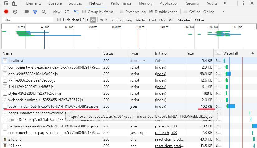
export default IndexPage;If we want to see the JSON file we mentioned earlier, we’ll have to build the app with gatsby build and open the Network tab of the Chrome DevTools. But I’ve already done this for you. In the next image, you can see the size of the file which is 102kb for our query (which is acceptable for so many images):

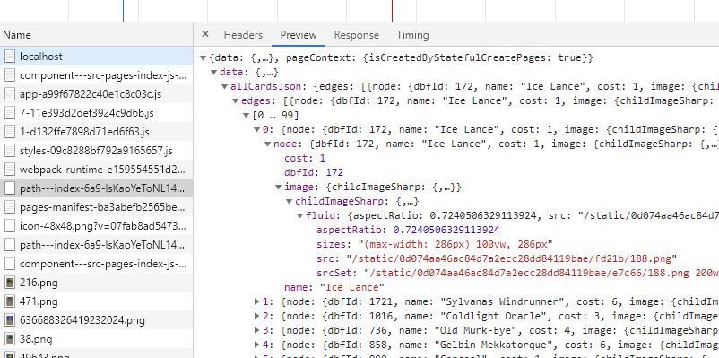
And in the following image, you can see what the object looks like if you open it in the preview:

Add FixedSizedGrid from react-window
We have our data; let’s now create the actual grid. As we said earlier, we’ll use the FixedSizeGrid from react-window. We’ll also use the standalone AutoSizer component from react-virtualized. This component will make our grid responsive and will try to fill all the available space, so we don’t have to specify a static grid width and height.
We start with the Grid, and later we’ll add the Cell. Create a new file src/components/Cards.jsx, paste the following code, and we’ll talk about it later:
import React from "react";
import { FixedSizeGrid as Grid } from "react-window";
import AutoSizer from "react-virtualized-auto-sizer";
import "./cards.css";
const Cards = ({ cards }) => (
<div
style={{
minHeight: "100vh",
backgroundColor: "#d6cae2",
marginTop: "2em",
position: "sticky",
top: "0px",
}}
>
<AutoSizer defaultWidth={1920} defaultHeight={1080}>
{({ width, height }) => {
const cardWidth = 286;
const cardHeight = 395;
const columnCount = Math.floor(width / cardWidth);
const rowCount = Math.ceil(cards.length / columnCount);
return (
<Grid
className="grid"
width={width}
height={height}
columnCount={columnCount}
columnWidth={cardWidth}
rowCount={rowCount}
rowHeight={cardHeight}
itemData={{ cards, columnCount }}
>
{Cell}
</Grid>
);
}}
</AutoSizer>
</div>
);
export default Cards;Also, create a CSS file src/components/cards.css that we’ll use to center the cards inside the Grid:
/* to center cards inside grid */
.grid > div {
position: relative;
margin: auto;
}Let’s explain what we do in the code above:
- In the
AutoSizercomponent, we pass adefaultWidthand adefaultHeight. That’s useful at build time when we don’t have the window object available. - We’re calculating the number of columns and rows based on the number of cards we have and their size in pixels (
columnCount,rowCount). - The “grid”
classNameprop is used for centering the cards with CSS. We’re specifying thecolumnWidthandrowHeightto be equal to thecardWidthandcardHeightrespectively. Finally, we pass with theitemDataprop thecardsand thecolumnCountdown to theCellcomponent that we’ll see shortly.
For this example, we don’t have to create a separate file for the Cell. It would have made more sense to do that if we were developing a more complex app. So in the same file, we continue with the Cell and the gatsby-image components:
import React from "react";
import { FixedSizeGrid as Grid } from "react-window";
import AutoSizer from "react-virtualized-auto-sizer";
import GatsbyImage from "gatsby-image"
import "./cards.css";
const Cell = ({ columnIndex, rowIndex, style, data }) => {
const { cards, columnCount } = data
const singleColumnIndex = columnIndex + rowIndex * columnCount
const card = cards[singleColumnIndex]
return (
<div style={style}>
{card && (
<div
key={card.dbfId}
style={{
width: "286px",
height: "395px",
display: "inline-block",
}}
>
<GatsbyImage
title={card.name}
fluid={card.image.childImageSharp.fluid}
/>
</div>
)}
</div>
)
}
const Cards = ({ cards }) => (/* ...skipping Cards */);
export default Cards;Let’s explain what happens here:
- The
Cellcomponent, which represents each card, takes from theGrid3 standard props:columnIndex,rowIndex, andstyle. It also takes the optionaldataprop which comes from theitemDatawe mentioned earlier. - We see that we apply that
styleprop to the container. The style prop positions our cells inside the grid. - Because the
Gridgives us only thecolumnIndexand therowIndex, but our cards are in a one-dimensional array, we’re doing a conversion with thesingleColumnIndexvariable. - Sometimes, the cards may not fill the last row. In this case, the card would be
undefinedbecause thesingleColumnIndexwill point out of the array. Additionally, we’ll render an empty container, and not bother rendering the card stuff (I’m talking about thecard &&check).
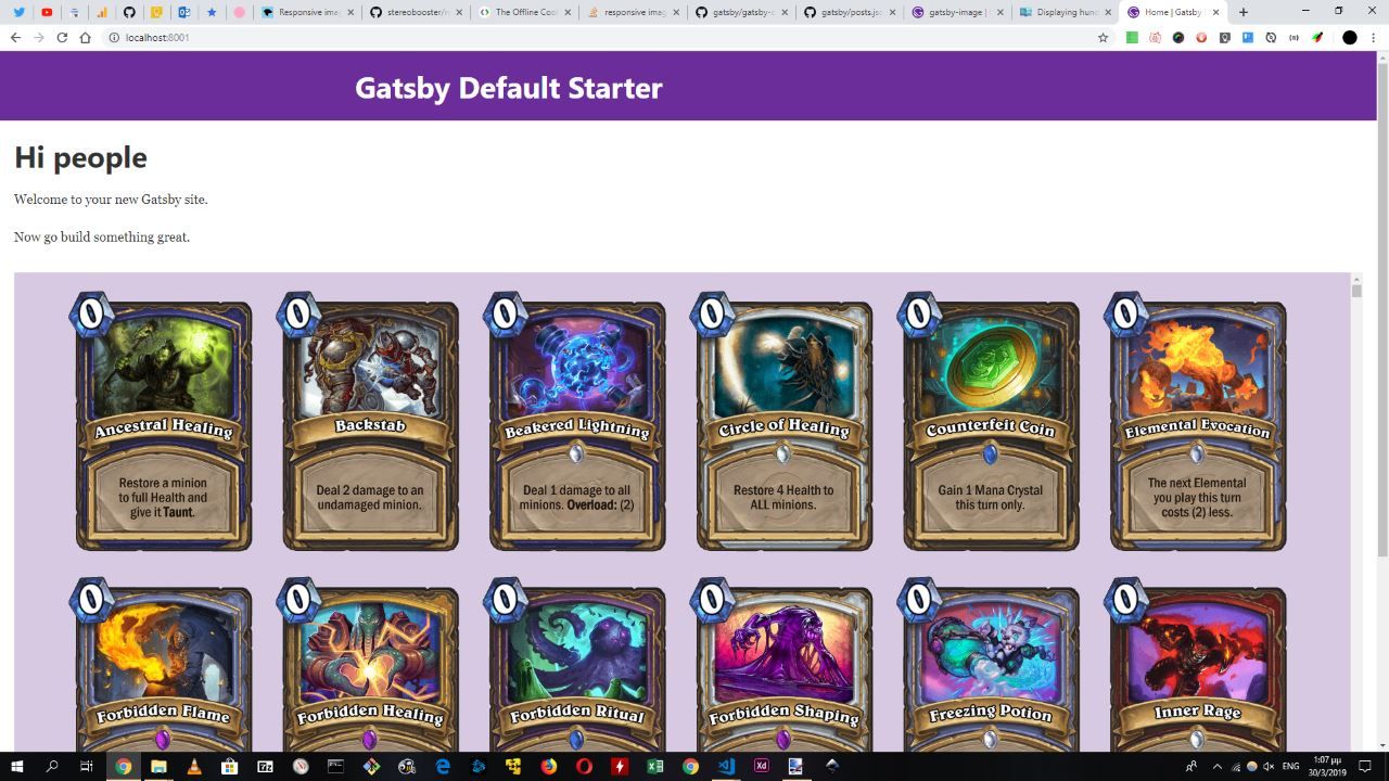
Now, if we want to see the result, we’ll have to comment out the 2 “cards” lines we added earlier in the index page, and remove the console.log statement. In the following image, we can see the result:

One last thing we want to do is to optimize the performance of our Grid.
Optimize performance
We already have a performance optimization in our Grid. We avoid passing an anonymous function as a cell. When we do that, the cell mounts/unmounts between renders, and that’s a problem when we render complex cells. That’s why the itemData prop exists by the way. It allows us to pass data down to our cells instead of doing that with an anonymous component and composition.
The first thing we want to do is to make our cell a memo component (aka pure component). On top of that, we’ll compare its props with the areEqual function (the equivalent of shouldComponentUpdate for functional components) from react-window to skip renders if the complex props like the style don’t change (deep equality check instead of shallow from the pure component).
You can add the highlighted lines in the src/components/Cards.jsx file:
import React, { memo } from "react";
import GatsbyImage from "gatsby-image";
import { FixedSizeGrid as Grid, areEqual } from "react-window";
import AutoSizer from "react-virtualized-auto-sizer";
import "./cards.css";
const Cell = memo(({ columnIndex, rowIndex, style, data }) => {
const { cards, columnCount } = data
const singleColumnIndex = columnIndex + rowIndex * columnCount
const card = cards[singleColumnIndex]
return (
/* ...skipping render */
)
}, areEqual);
// ...skipping the restYou can optionally add memoization for the itemData, although I believe this is not necessary for our application. Anyway, this is how you do with the memoize-one library:
import React, { memo } from "react";
import GatsbyImage from "gatsby-image";
import { FixedSizeGrid as Grid, areEqual } from "react-window";
import AutoSizer from "react-virtualized-auto-sizer";
import memoize from "memoize-one";
import "./cards.css";
const createItemData = memoize(({ columnCount, cards }) => ({
columnCount,
cards,
}));
const Cell = memo(({ columnIndex, rowIndex, style, data }) => {
/* ...skipping Cell */
}, areEqual);
const Cards = ({ cards }) => (
<div
style={{
minHeight: "100vh",
backgroundColor: "#d6cae2",
marginTop: "2em",
position: "sticky",
top: "0px",
}}
>
<AutoSizer defaultWidth={1920} defaultHeight={1080}>
{({ width, height }) => {
const cardWidth = 286;
const cardHeight = 395;
const columnCount = Math.floor(width / cardWidth);
const rowCount = Math.ceil(cards.length / columnCount);
const itemData = createItemData({ cards, columnCount });
return (
<Grid
className="grid"
width={width}
height={height}
columnCount={columnCount}
columnWidth={cardWidth}
rowCount={rowCount}
rowHeight={cardHeight}
itemData={itemData}
>
{Cell}
</Grid>
);
}}
</AutoSizer>
</div>
);
export default Cards;For more performance tips, check this YouTube video from the creator of the react-window library. In the next section, I compiled a list with some limitations and potential problems.
Caveats
- We have to forget about the progressive loading feature of the
gatsby-imagecomponent due to bundle size. If we could configure gatsby-plugin-sharp to put the placeholder images in a separate file instead of adding them as inline base64 strings in a JSON file, this would not be a problem. - If a user scrolls down the grid really fast, they will trigger a ton of downloads, and that will compromise the user experience and our bandwidth. I’m talking about server bandwidth, but the same is true for user data. You can see that in action if you add a Network throttle in the Performance tab of Chrome DevTools.
- If, for some reason, we can’t combine our data with the images, as we showed earlier, and they are in separate objects, we’ll have to search for the image on runtime, with a small performance overhead:
// Getting the data from the GraphQL queries (index page).
const cards = data.allCardsJson.edges.map((n) => n.node);
const images = data.allImageSharp.edges.map((n) => n.node);
// Finding the image (cell component).
const image = images.find((img) =>
img.node.fluid.src.includes(`/${cardToRender.imageUrl}`)
).node.fluid;Other things to read
Popular
- Reveal animations on scroll with react-spring
- Gatsby background image example
- Extremely fast loading with Gatsby and self-hosted fonts