A performance problem when you combine useReducer and useContext
Table of contents
TL;DR: Instead of choosing redux and react-redux for state management, I created an AppContainer component that internally uses a useReducer hook, and shares the dispatch/state with the useContext hook. This can lead to performance problems for components that use the context, but when the context changes, they don’t need to render again.
To solve this, I broke the component into 2 parts; into a parent component that uses the context, and a child component that takes the context data as props. This way, we can use PureComponent (memo) and shouldComponentUpdate (areEqual) on the expensive child to skip unnecessary renders. It’s the second solution our prophet gives in this GitHub issue. Alternatively, you can use redux and react-redux…
We’ll also see the steps I took to understand the problem, measure, and finally optimize the code. As you can imagine, I didn’t come up with all this, but instead, I read the work of other brilliant people.
Disclaimers
I want to say here that I don’t have a clue if the React team approves this pattern (useReducer + useContext instead of React + react-redux). The hooks are still new, and the documentation not complete. So, it’s expected that we, as developers, we’ll find a way to misuse them and embarrass ourselves in the process.
Anyway… I used it because I wanted a side project to experiment with React hooks and more specifically with the useReducer hook. I searched in Google, and some guides (when I say guides I mean blog posts) suggested using it alongside the useContext hook. I liked that because I would not have to “mapStateToProps” or “mapDispatchToProps”, which is something that annoys me, but instead, I would just require stuff from the useContext hook. With that out of the way, let’s see what this app does.
A quick description of the app
Hearthstone is an online card game created by Blizzard. HSFilter, on the other hand, gives you the ability to filter Hearthstone cards based on attributes you choose, and then add them to a deck (max 30 cards) that you can use to play against your opponents. It’s built with Gatsby if you’re wondering. Let’s now proceed with some general performance advice.
Performance advice
First of all, you don’t have to optimize for performance if you don’t have performance problems. If you do, you’re doing premature optimization. Instead, you start by writing readable code that you are comfortable with, after that you measure the performance, and if you have problems then you optimize.
It’s also better to spot the performance problems in the production build. That’s because the production code is much faster than the development build. As a result, a problem in development may be negligible in production. So don’t freak out with dropped frames in development.
Also, it’s good to add some CPU throttle in Chrome DevTools to emulate the performance on lower-end devices. Your development pc is probably quite powerful, so it will handle well whatever you throw at it.
Understanding that we have a problem
So having all that in mind, I started monitoring some interactions in my app with Chrome DevTools (performance tab). One problem I noticed (spoiler: they were more), was occurring when I clicked a card from the collection with the intention to add it into the deck. You can see the interaction in the following gif:
First of all, I can hear the Hearthstone players saying: “Why do you even want to add Cursed Blade into your deck; that card is terrible.” I agree, but let’s move on. We see in the following image that the click handler took about 275ms with an x4 CPU throttle applied in the production build:
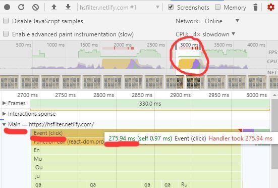
This is pretty bad if you have many users with mid to low-end devices. So another tip is to always use your analytics to see if it’s even worth spending your time optimizing. Maybe the majority of your users access your app from a desktop. I don’t have any users but whatever. This problem seemed interesting enough, so I continued investigating. The next thing we’ll do is to figure out if we use sub-optimally our 3rd party libraries.
Investigating 3rd party libraries
For this project, I’m using the FixedSizeGrid from react-window to display the cards. It’s similar to react-virtualized, but simpler, faster, and smaller. If you are not familiar with the library, you can skip to the next section; it’s not the point of the post anyway. I will now list the code for the component that renders the FixedSizeGrid and the code for the GridItem.
Take a quick look at the highlighted lines, and we’ll talk about it later:
Cards.jsx code snippet
import React, { useState, useEffect, useRef, useContext } from "react";
import PropTypes from "prop-types";
import styled from "styled-components";
import { FixedSizeGrid as Grid } from "react-window";
import AutoSizer from "react-virtualized-auto-sizer";
import memoize from "memoize-one";
import { boxShadow } from "styled-system";
import { toast } from "react-toastify";
import { Flex, Box, Heading, Centered, Text } from "../Primitives";
import GridItem from "./GridItem";
import { DeckContext } from "../../context/deck-context";
import CardDetailsModal from "../Modals/CardDetailsModal";
// skipping styling and boring utilities...
const createOpenModal = memoize((func) => (card) =>
func({ open: true, card })
);
const createItemData = memoize(
(columnCount, searchedCards, openModal) =>
console.log("it runs!") || {
columnCount,
searchedCards,
openModal,
}
);
const Cards = ({ cards }) => {
const { deck } = useContext(DeckContext); // skipping state and effects...
return (
<Container bg="tuscan" color="raisinBlack">
{/* skipping... */}
<Box height="100vh" style={{ overflowX: "hidden" }}>
{searchedCards.length > 0 ? (
<AutoSizer defaultWidth={1920} defaultHeight={1080}>
{({ width, height }) => {
const cardWidth = width < 500 || height < 500 ? 180 : 250;
const cardHeight = width < 500 || height < 500 ? 250 : 345;
const columnCount = Math.floor(width / cardWidth);
const rowCount = Math.ceil(
searchedCards.length / columnCount
);
const openModal = createOpenModal(setModalInfo);
const itemData = createItemData(
columnCount,
searchedCards,
openModal
);
return (
<CenteredGrid
columnWidth={cardWidth}
columnCount={columnCount}
rowHeight={cardHeight}
rowCount={rowCount}
height={height}
width={width}
itemData={itemData}
>
{GridItem}
</CenteredGrid>
);
}}
</AutoSizer>
) : (
<Centered minHeight="50vh">
<Text fontSize={4}>No cards. Try different filters.</Text>
</Centered>
)}
</Box>
</Container>
);
};
Cards.propTypes = {
cards: PropTypes.arrayOf(PropTypes.object).isRequired,
};
export default Cards;GridItem.jsx code snippet
import React, { useState, useEffect, useRef, useContext, memo } from "react";
import PropTypes from "prop-types";
import styled from "styled-components";
import { areEqual } from "react-window";
import { Image as BaseImage } from "rebass";
import { toast } from "react-toastify";
import { Box, Button } from "../Primitives";
import { FaSearch, FaMinus } from "../Icons";
import { addUnconditionally, validateAdd, inDeck } from "../../utils/deck";
import { DeckContext } from "../../context/deck-context";
import { addCard, removeCard } from "../../ducks/deck";
// ...skipping styling and utilities
const GridItem = memo(({ columnIndex, rowIndex, style, data }) => {
const { columnCount, searchedCards, openModal } = data;
const singleColumnIndex = columnIndex + rowIndex * columnCount;
const cardToRender = searchedCards[singleColumnIndex];
const errorToast = useRef();
const imageRef = useRef();
const { deck, dispatch } = useContext(DeckContext);
const [quantity, setQuantity] = useState(
cardToRender ? getQuantity(deck, cardToRender) : 2
);
useEffect(() => {
setQuantity(getQuantity(deck, cardToRender));
}, [cardToRender, deck]);
return (
<Container p={2} style={style}>
{cardToRender && (
<>
<ActionContainer>
{quantity && (
/* ...skipping UI stuff */
}
</ActionContainer>
<Button
variant="transparent"
aria-label={`Add ${cardToRender.name}`}
data-microtip-position="bottom"
role="tooltip"
style={{ padding: 0 }}
onClick={() => {
try {
const resultingDeck = addUnconditionally(deck, cardToRender);
validateAdd(resultingDeck, deck.ignoreSize);
dispatch(addCard({ card: cardToRender }));
} catch (err) {
if (!toast.isActive(errorToast.current)) {
errorToast.current = toast.error(`🔥 ${err.toString()}`);
}
}
}}
>
<Image
ref={imageRef}
alt={cardToRender.name}
style={{ opacity: getOpacity(cardToRender, quantity) }}
src={`/resources/images/${cardToRender.imageUrl}`}
/>
</Button>
</>
)}
</Container>
);
}, areEqual);
// ...skipping proptypes
export default GridItem;In Cards.jsx I render a grid (CenteredGrid) and a GridItem as a child. I also use the DeckContext, and, as a result, the component renders when the deck in the context changes.
In GridItem.jsx, I again use the DeckContext, but, in addition to that, I use a click handler that dispatches to the reducer an action (addCard). Finally, I render an image and some other elements depending on the quantity. The quantity represents the number of copies of a card inside the deck.
Some other stuff I’ve highlighted are performance optimizations mentioned in this video by Brian Vaughn, the creator of the library. Let’s name those:
- We avoid passing as a grid child an anonymous component. Instead, we pass a reference e.g.
{GridItem}(Reference? Is that what it’s called? I’m not sure). Basically, if you pass an anonymous component, and the parent renders, it always mounts the children instead of updating them (ouch, that’s bad). - We’re using
memofor theGridItemwhich is basically the equivalent of thePureComponentfor functional components. - We are comparing the props of the
GridItemwith theareEqualfunction fromreact-window. This is the equivalent forshouldComponentUpdatethat’s already implemented forCellcomponents ofreact-windowgrids. - We’re also using memoization for the props we pass with itemData (this is a
Gridprop) in eachGridItemfrom theGrid. Because some of the props we pass are complex types (not primitives), and we assign them at render, even if they are the same in value, they change in reference. A new object is created in every render, so theGridItemwill render because it does only a shallow comparison of its props. So we memoize them, and if their value is the same, we take the cached reference.
P.S. about the memoization part: I think we could achieve the same with an areEqual function in the GridItem. Generally, you use memoization for expensive operations, and not so much for the reason we did here. Also, this explanation took really long, and this is generally a sign that I messed it up, so have that in mind…
This brought a significant improvement; from 550ms in development with an x4 CPU throttle to the current 439ms, that you’ll see shortly in the next section.
Using Chrome DevTools
Now that we know that we’re using our dependencies in the most performant way, let’s go in development mode, and investigate the issue further. The development mode has a really useful tool which is the User Timing API dropdown (named as Timings). You can also use the React Profiler if you have the React developer tools installed. The profiler is something similar to Timings dropdown, and I won’t use it here. If you’re reading this in 2020, you should use the new React profiler.
We narrow down to one of the red lines in the overview, marked by the horribly drawn red circle in the image below. A red line means that something took longer than expected, and as a result, we dropped some frames. We go to the main dropdown to find the click event, as we did in production (previous image). Now, because we are in development, we have access to the Timings dropdown. If we open it, we see the following:
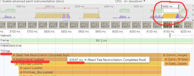
We see that our AppContainer updates in 439ms. If we scroll down (next image), we see that we update the ParentFilterGroup, which is something like a navbar in the app, and the Cards component that takes the most time. In the Cards component, we see some components being updated. Those components are our GridItems:
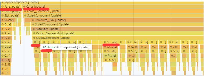
They take about 12ms to update, and one of them in the middle takes about 20ms to update. This is something that should not happen. We expected to see one GridItem updating for 20ms because this is the card we add to the deck, and it’s quantity changes. When the quantity changes, we render an extra button that, when clicked, removes the card from the deck, and we decrease the opacity of the image. The rest of the cards, though, should update almost instantly because nothing changes for them.
This happens because if we take look at the code for our GridItem, we can see that we’re using the DeckContext. The deck changes in the context when we add a card, so every GridItem renders again no matter what. Ideally, we would want to have the deck from DeckContext passed as a prop in the GridItem. This way, we can check with shouldComponentUpdate (or with an areEqual implementation in functional components) if the GridItem should re-render.
Splitting the GridItem component
To achieve that, we’ll have to split the GridItem component into 2 parts. We’ll end up with one parent component that uses the context, and a child component that takes the context data as props. We can see below the code after the changes:
Code after splitting:
// omitted...
<CenteredGrid
columnWidth={cardWidth}
columnCount={columnCount}
rowHeight={cardHeight}
rowCount={rowCount}
height={height}
width={width}
itemData={itemData}
>
{GridItemWithDeck}
</CenteredGrid>
// omitted...import React, { useRef, useContext, memo } from "react";
import PropTypes from "prop-types";
import styled from "styled-components";
import { areEqual } from "react-window";
import { Image as BaseImage } from "rebass";
import { toast } from "react-toastify";
// skipping internal dependencies and styling...
export const GridItemWithDeck = memo(
({ columnIndex, rowIndex, style, data }) => {
const { columnCount, searchedCards, openModal } = data;
const singleColumnIndex = columnIndex + rowIndex * columnCount;
const cardToRender = searchedCards[singleColumnIndex];
const { deck, dispatch } = useContext(DeckContext);
const quantity = getQuantity(deck, cardToRender);
return (
<Container p={2} style={style}>
<GridItem
deck={deck}
dispatch={dispatch}
cardToRender={cardToRender}
quantity={quantity}
openModal={openModal}
/>
</Container>
);
},
areEqual
);
GridItemWithDeck.propTypes = {
// skipping proptypes...
};
// So to recap:
// We don't render if the parent renders because
// we are a PureComponent (memo). We render if are props
// change and we determine that with a shallow
// comparison. Now in the case where the deck has
// changed because we added a card in the deck, we don't
// render if the quantity remains the same. We achieve
// the last by implementing shouldComponentUpdate (areEqual).
const childAreEqual = (prev, next) => {
if (prev.deck !== next.deck && prev.quantity === next.quantity)
return true;
return false;
};
// eslint-disable-next-line react/no-multi-comp
const GridItem = memo(
({ deck, dispatch, cardToRender, openModal, quantity }) => {
const errorToast = useRef();
const imageRef = useRef();
return cardToRender ? (
<>
<ActionContainer>
{quantity && (
<Button
variant="icon"
aria-label="Remove 1 card"
data-microtip-position="bottom-left"
role="tooltip"
bg="paradisePink"
onClick={() => {
try {
dispatch(removeCard({ card: cardToRender }));
} catch (err) {
if (!toast.isActive(errorToast.current)) {
errorToast.current = toast.error(
`🔥 ${err.toString()}`
);
}
}
}}
>
<FaMinus />
</Button>
)}
<Button
variant="icon"
aria-label={`${cardToRender.name} details`}
data-microtip-position="bottom-left"
role="tooltip"
bg={heroColors[cardToRender.cardClass]}
onClick={() => openModal(cardToRender)}
>
<FaSearch />
</Button>
</ActionContainer>
<Button
variant="transparent"
aria-label={`Add ${cardToRender.name}`}
data-microtip-position="bottom"
role="tooltip"
style={{ padding: 0 }}
onClick={() => {
// skipping handler...
}}
>
<Image
ref={imageRef}
alt={cardToRender.name}
style={{ opacity: getOpacity(cardToRender, quantity) }}
src={`/resources/images/${cardToRender.imageUrl}`}
/>
</Button>
</>
) : (
<div />
);
},
childAreEqual
);
GridItem.propTypes = {
// skipping proptypes...
};
GridItem.defaultProps = {
quantity: null,
};
export default GridItem;In the code above, we now have 2 components: the GridItemWithDeck and the GridItem. The GridItemWithDeck uses the context, and it transforms the data from the Cards component into something more useful for the GridItem. It’s a memo (pure) component, and it checks its props on every update with the areEqual function from react-window.
The GridItem is also a memo component, but it checks its props with the custom childAreEqual function. That function basically says: “If the deck changed, but the quantity remains the same, don’t render”. This combined with the shallow prop comparison from memo should do the trick.
Let’s see how it fares when we try to measure it in development:
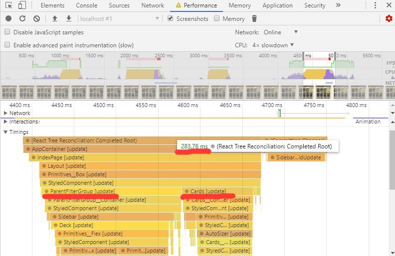
283ms from 439ms. And if we zoom-in at the grid part:
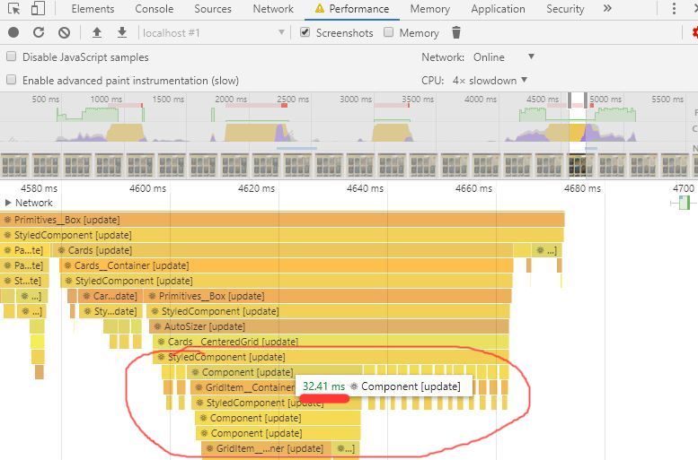
We see that the one GridItem (card) that is added to the deck takes 32ms to update, and the rest much less at about 2ms. We’re happy with that because it’s the expected behavior.
One last thing we want to do is to build the code and go back to the production to measure. You’ll notice that a lot of back and forth goes on between development and production. These are the results in production with an x4 slowdown:
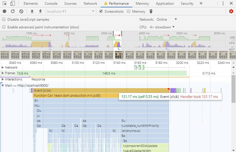
One of the longer handlers took 131ms to complete. I remind you that without the splitting the handler took about 275ms. If we test this without CPU throttling, we don’t drop any frames, so no red lines at all for desktop users.
Wait a minute… (PS)
So mission complete! Our app updates now almost twice as fast. We should celebrate, right?
NO! We messed up! (ok, I messed up, you didn’t do anything). We were not careful with the implementation of the areEqual function, and as a result, we don’t update the deck inside our click handlers. So, every time we add a card, we update only the deck reference of the card we just added. The rest of the cards remember the old deck. As a result, our validate function inside the click handler does nothing!
To fix this, we’ll have to make the button that adds the card into the deck a child of the GridItemWithDeck. We’ll lose some performance gains, but it’s necessary if we want an app without bugs. This is a performance test in development with x4 CPU throttle after the bug fix:
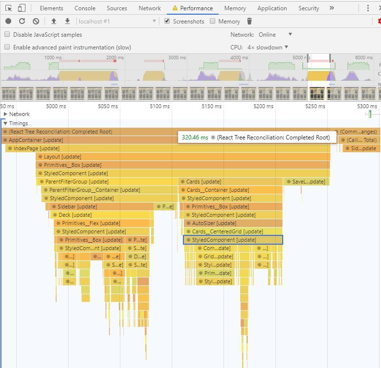
The longest update took about 320ms after the final split.
As you can see, React has good reasons to re-render when a prop or a parent changes because it’s really easy to make mistakes when implementing the areEqual method…
What we’ve learned
- You have to be careful with the context hook because when it changes, it forces expensive re-renders that may not be necessary.
- You can mitigate that by splitting the components into 2 new components.
PureComponent(memo) andshouldComponentUpdate(areEqual) can help you skip renders.- We saw some performance optimizations for
react-windowthat we can use when we render expensive items. - Spend your time optimizing for performance only if it matters to your users.
- Always measure before you start optimizing.
- We saw how to measure the performance of our app with Chrome DevTools and the performance tab.
- Be careful when you implement the
shouldComponentUpdateorareEqualmethods because it’s easy to introduce bugs to your application.
Further reading/sources
Other things to read
Popular
- Reveal animations on scroll with react-spring
- Gatsby background image example
- Extremely fast loading with Gatsby and self-hosted fonts